I was hoping that my second attempt at writing a letter from the editor would be easier — it’s not. It’s still nearly impossible to sum up the number of hours, the amount of effort, and the sum of coffee cups that go into producing a magazine.
Nonetheless, since completing The Varsity’s fall magazine, I’ve worked to ensure the winter magazine’s articles push boundaries and shift perspectives.
The theme ‘physical’ followed a deep ponder sesh I had while making dinner. I liked the multiplicity of it. Turns out, it was appropriate given the timeliness of many of the articles that were inspired by it.
For example, in light of the #MeToo movement and societal discussions of sexual violence, Teodora Pasca wrote a shocking article showcasing the stories of 15 students who have experienced sexual harassment or assault online (page 28).
Additionally, the current state of youth homelessness in the city was explored by Steven Lee — a student who has experienced homelessness — and Ilya Bañares. Both writers worked incredibly hard to ensure that this article became a reality, and the final product is jarring (page 42).
I’m extremely proud of all of the contributors, designers, and those who helped out with the magazine; the stories were inspiring, funny, and important.
I invite you to grab a coffee, find a cozy seat, and enjoy flipping through the Physical Issue.
—Kaitlyn Simpson
After the first Varsity magazine, I thought I knew everything I needed to know about what goes into creating a magazine. Bold. But then I remembered how many times articles changed, how many visuals shifted, and how all the ideas I started out with were nothing like what was eventually executed. I guess that’s part of the fun of it all.
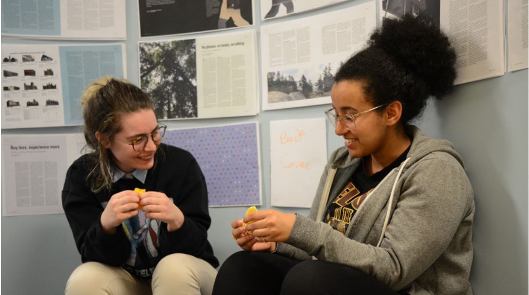
The process of coming up with the cover was a result of a creative back and forth that sounded something like this:
“So this is the physical issue. Think body, touch, aggressive… maybe texture?”
“That’s not really going anywhere. What are the main colours in it?”
“There’s quite a bit of orange.”
“How about an orange on the cover?”
Plus a number of other changes. The image featured on the back cover is a close-up of Bernini’s “The Rape of Persephone,” with the frame highlighting the hyper-real sense of touch that you would never usually associate with a material like marble.
Alongside the cover, the Physical Issue brings together in-your-face visuals that invite you into stories that often feel out of reach. The designs facilitate these stories to take up the space they deserve. Please enjoy!
—Elham Numan