I’ve finally given into calling Toronto ‘home,’ but it still unnerves me because I know it’s only for now. The other day, I realized that if I stay in my current student apartment until I graduate, my short time here will already be the second longest I have ever stayed in one house.
Initially, I wanted this magazine to be identity themed, but I ultimately decided home was the bigger idea; so much of our identities are shaped by what we call home. In this diasporic world where we’re all constantly moving, it is nearly impossible to tie home down to a building — so what is it? When I was a kid, that question kept me up at night as my family moved from apartment to townhouse and suburb to city.
In this issue, I looked for pieces that would cover as broad a scope as possible. Alex McKeen explores how we commodify our living spaces (page 8), Farwa Khtana looks into life for Syrian refugees as they settle into Canada (page 19), and Teodora Pasca tries to reconstruct memories of her birthplace (page 52).
I hope that this magazine gives you comfort in knowing that home doesn’t have to be any specific place — it doesn’t even have to be a place at all (page 2). Instead, I sincerely hope you find home in wherever and whatever you love and makes you feel loved. In short, the concept of home can change or vary, and like my apartment, sometimes it can be a complete mess — but that’s okay.
On that note, please enjoy. Hopefully this magazine finds a home on your coffee table or bookshelf, if only for a little while.
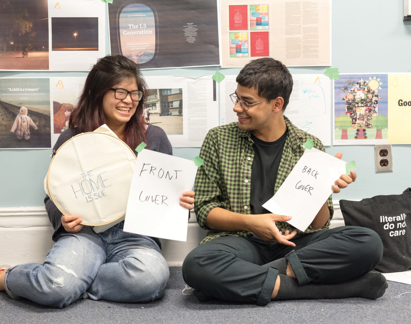
— Rachel Chen, Magazine Editor

I spent a lot of time this summer trying to figure out what my role at The Varsity actually means. With a masthead that changes every year, it’s hard to make your mark. It’s inevitable that my successors will tweak and adjust The Varsity’s style to make it align with their vision of the paper.
Therefore, how much control do I have over what The Varsity looks like and how long will it last? I felt like The Varsity Magazine was my chance to create a unique, timeless product that I could call my own.
The Home Issue has been a wonderful opportunity to explore the theme beyond a two-storey, triangular roof ‘house’ that is sometimes synonymous to the word. We tried to limit the use of the home motif as much as possible, paying attention to more symbolic representations of the home feeling.
Being part of the 1.5 generation (page 44), home is something that also transcends geographical borders for me. I am as at home in Toronto as I am in Karachi, Pakistan — but for entirely different reasons. Yet, there is familiarity in both cases and the design team aspired to carry that feeling throughout the visuals.
From the Tim Hortons coffee cups in “Does Canada matter?” (page 26) to Shringle’s adventures in IKEA (page 6), the visuals are all meant to invoke feelings of familiarity, of home. The unassuming design elements complement but don’t overpower the visuals.
With that in mind, I hope that The Home Issue resonates with you as much as it did with me. It was produced over five very long, burrito and coffee-fuelled days; we are immensely proud of the final product.
— Mubashir Baweja, Creative Director
