It sometimes seems that we are always in transition. In the production of this magazine, that was definitely the case. In the course of designing these articles, we threw out countless ideas, tweaked visuals, and started from scratch more than we had ever anticipated. Producing this work was a journey in and of itself.
In many ways the process of designing this magazine was reflective of the content inside — always in flux, constantly evolving, and indicative of developing ideas within. The cover depicts a literal crossroads — the intersection of Queen Street West and Spadina Street. It represents the themes of change in the magazine, coming together at the beginning of production and serving as an anchor for its design — for once, the cover was the easy part.
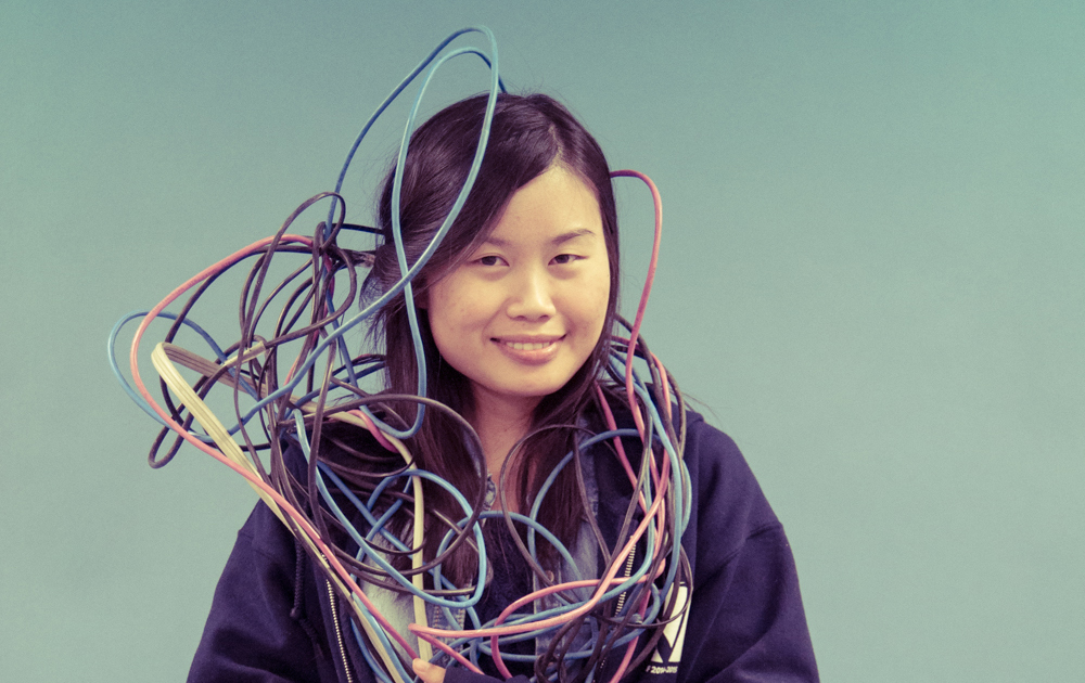
The content of the magazine reflects a diverse range of people, interests, and spaces. In designing these pages, we tried to mirror this diversity, individualizing the design to the text. From the literal intersection of the cover, we transition into more conceptual iterations of interaction to inspire our readers to think about the transformation we continuously find ourselves in.
Transition is not easy, and necessitates that we let go of the past in order to move forward. We tried to break our moulds with this magazine, push ourselves, and create a design that reflects the potential that comes with change.
— Mari Zhou
Design Editor, 2014–2015